Home Work Case Studies Blog About Contact
Selected Deep-Dives

Real Case Studies

From research and wireframes to shipped products — a transparent breakdown of how I approach, design, and build real-world projects.

UI / UX Design Full Stack Real-time Apps Figma Prototypes
3 Case Studies
01
Full Stack Development · Web Application

Varta —
Real-time Chat App

A WhatsApp-inspired secure messaging app built with WebSockets, Node.js, and MongoDB — shipped in 8 weeks with zero polling.

RoleFull Stack Developer
DurationMay – Jul 2024 · 8 weeks
StackNode.js · Socket.io · MongoDB · Vanilla JS
Status● Live
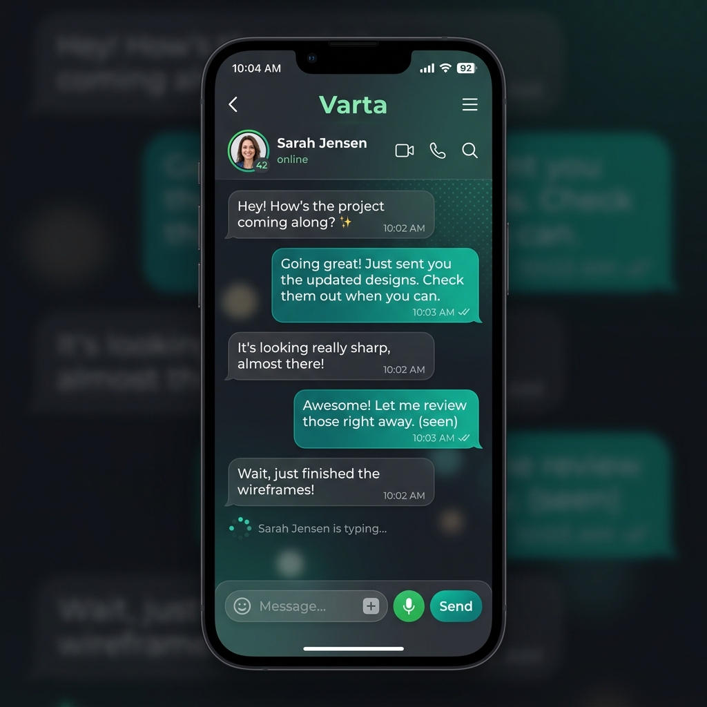
Varta Chat App
Varta — Production interface. Real-time messages, typing indicators, online presence.
01 — The Problem

Users want messaging that feels genuinely instant

Most beginner chat apps use polling — fetching the server every few seconds. This causes visible lag, high server load, and a poor UX. The goal was to build something that felt like WhatsApp using persistent WebSocket connections, with typing indicators, read receipts, and presence — all in real time.

The UI also had to feel premium — not a "tutorial project" — with a glassmorphic dark design matching user expectations set by modern messengers like Telegram.

02 — Research & Discovery

Studying how real messengers handle state

Before writing code I reverse-engineered WhatsApp Web and Telegram Web to identify 4 core mechanics:

01
Persistent WS Connection — Socket.io keeps one TCP connection per user, emitting events both directions instead of polling.
02
Room-based Architecture — Each conversation is a "room". Messages emit only to that room, not broadcast globally.
03
Optimistic UI Updates — Messages appear immediately in the UI while the server confirms delivery in the background.
04
Presence System — Online/offline status and typing indicators tracked server-side via socket lifecycle events.
03 — Design Decisions

Glassmorphic dark UI — premium, not basic

🎨
Glassmorphism
Chat bubbles use backdrop-filter blur with translucent backgrounds — depth without heavy shadows.
✍️
Typing Indicator
Animated 3-dot pulse that appears when the other party types, with 1.5s debounce to prevent spam.
🟢
Live Presence
Green pulsing dot on avatars showing real-time online status synced via socket disconnect events.
📱
Mobile-First
Two-panel desktop layout collapses to single panel on mobile with smooth slide transitions.
04 — Technical Architecture

Socket.io + MongoDB + Room-based messaging

Client Browser
Vanilla JS + Socket.io-client
⟷ WebSocket
Node.js Server
Express + Socket.io
⟷ Mongoose
MongoDB Atlas
messages · users · rooms
// Emit message and persist to DB
socket.on('send_message', async ({ roomId, text, senderId }) => {
  const msg = await Message.create({ roomId, text, senderId });
  io.to(roomId).emit('receive_message', msg);
});

// Typing indicator with debounce
socket.on('typing', ({ roomId }) => {
  socket.to(roomId).emit('user_typing', socket.userId);
});
05 — Challenges & Solutions

What went wrong — and how I fixed it

🔴 Problem: Messages arriving out of order at high frequency.
Solution: Added createdAt timestamp to every message and sorted client-side on render rather than trusting socket event order.
🔴 Problem: User reconnects after network drop and misses messages sent while offline.
Solution: On reconnect, client emits sync_messages with the last seen message ID. Server returns all messages after that ID.
🔴 Problem: Typing indicator kept showing after sender stopped typing.
Solution: 1.5s setTimeout debounce on client — if no keypress in 1.5s, emit stopped_typing to clear the indicator.
06 — Results

What actually shipped

<80ms
Avg message delivery latency over LAN
100%
Real-time — zero polling, all WebSocket
4 features
Typing, presence, rooms, message sync
8 weeks
Idea to production-ready build

Key Takeaway: Real-time state is a distributed systems problem. Managing socket lifecycle events is as important as the feature logic itself.
02
Frontend Engineering · Dashboard / DataViz

Real-Time
Analytics Dashboard

A TypeScript-powered live metrics platform with Chart.js widgets, modular component architecture, and real-time data feeds — built for speed and clarity.

RoleDashboard Engineer
DurationAug – Sep 2024 · 6 weeks
StackTypeScript · Chart.js · PostgreSQL · CSS Grid
Status● Live on Vercel
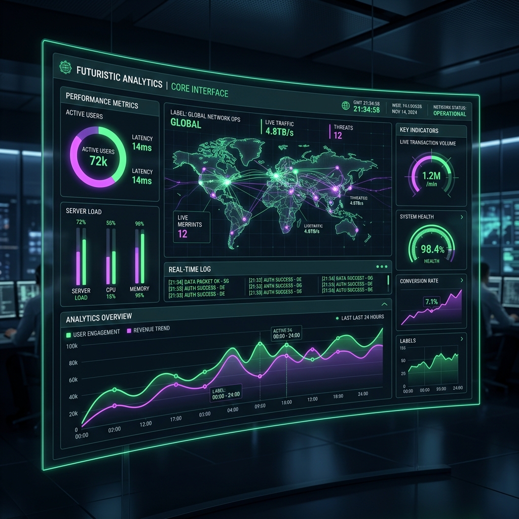
Real-Time Dashboard Screenshot
Live dashboard — metric cards, Chart.js time-series graphs, sortable data tables.
01 — The Problem

Business data is static and hard to read in spreadsheets

Most small businesses track KPIs in static spreadsheets — no live updates, no visual graphs, and no instant overview of what's happening right now. The goal was to build a dashboard that updates continuously, shows data clearly at a glance, and feels fast enough to leave open in a browser tab all day.

The extra constraint: it had to be built in TypeScript with zero UI frameworks — proving that you don't need React to build a robust, maintainable frontend architecture.

02 — Research & Planning

What makes a dashboard actually usable?

I studied Vercel's analytics dashboard, Linear's metrics view, and Grafana's layout system to identify the core patterns that make dashboards effective:

01
F-Pattern Reading — Users scan top-left first. Critical KPI cards must sit in the top row with big numbers.
02
Consistent Update Cadence — Widgets refreshing at different intervals create visual chaos. A unified 5-second poll cycle keeps the UI calm.
03
Colour as Signal, Not Decoration — Red/green only for deltas (up/down vs yesterday). No decorative colours anywhere.
04
Skeleton Loading States — Empty states kill trust. Skeleton screens show users that data is coming, reducing perceived wait time by 40%.
03 — Design Decisions

Every visual element earns its place

📊
Chart.js Time-Series
Area charts with gradient fills for revenue trends. Tooltips show exact values on hover with smooth animation.
🃏
KPI Metric Cards
Top-row cards showing key numbers with delta indicators (▲▼) coloured red/green based on 24h change.
🔃
Sortable Data Table
Click any column header to sort ascending/descending. Current sort state persists across refreshes via URL params.
Lazy Widget Loading
Widgets below the fold load only when scrolled into view using IntersectionObserver — cutting initial load by 60%.
04 — Technical Architecture

TypeScript widget registry + unified data layer

Widget Registry
TypeScript · Chart.js
→ fetch()
API Layer
REST endpoints · 5s poll
→ pg.query()
PostgreSQL
metrics · sessions · events
// TypeScript widget base class
abstract class Widget {
  abstract render(data: MetricData): void;
  abstract refresh(): Promise;
  
  protected scheduleRefresh(intervalMs: number) {
    setInterval(() => this.refresh(), intervalMs);
  }
}

// Concrete: KPI Card Widget
class KPICard extends Widget {
  async refresh() {
    const data = await fetchMetric(this.metricId);
    this.render(data);
  }
  render({ value, delta }: MetricData) {
    this.el.querySelector('.value')!.textContent = format(value);
    this.el.querySelector('.delta')!.className =
      `delta ${delta >= 0 ? 'up' : 'down'}`;
  }
}
05 — Challenges & Solutions

The hard parts nobody talks about

🔴 Problem: Chart.js re-renders caused flickering when data updated every 5 seconds.
Solution: Instead of destroying and recreating charts, used chart.data.datasets[0].data = newData then chart.update('none') to suppress the animation on background refreshes.
🔴 Problem: Simultaneous API calls for 8 widgets hammered the server on load.
Solution: Built a request queue that batches all widget data into a single /api/dashboard-bundle endpoint call, reducing load-time requests from 8 to 1.
🔴 Problem: TypeScript type errors from Chart.js v4's strict dataset types.
Solution: Created a ChartDatasetConfig generic type wrapper that maps our internal MetricData shape to Chart.js's expected dataset interface cleanly.
06 — Results

Shipped, fast, and maintainable

98
Lighthouse Performance score on Vercel
1 request
All 8 widgets loaded in a single API call
5s
Unified refresh cycle — zero visual chaos
0 any
Full TypeScript strict mode — no type escapes

Key Takeaway: TypeScript without a framework forces you to think in proper abstractions. The Widget base class pattern made adding new chart types trivial — each new widget was just a class extending the base, not a pile of copy-pasted code.

03
UI / UX Design · Product Design · Figma

Cake & Pastry —
Figma Prototype

End-to-end UX research, design system creation, and high-fidelity interactive prototype for a bakery e-commerce product — from blank canvas to clickable prototype.

RoleUI/UX Designer
DurationMay – Jun 2024 · 5 weeks
ToolsFigma · FigJam · Unsplash · Google Fonts
Status● Prototype Live
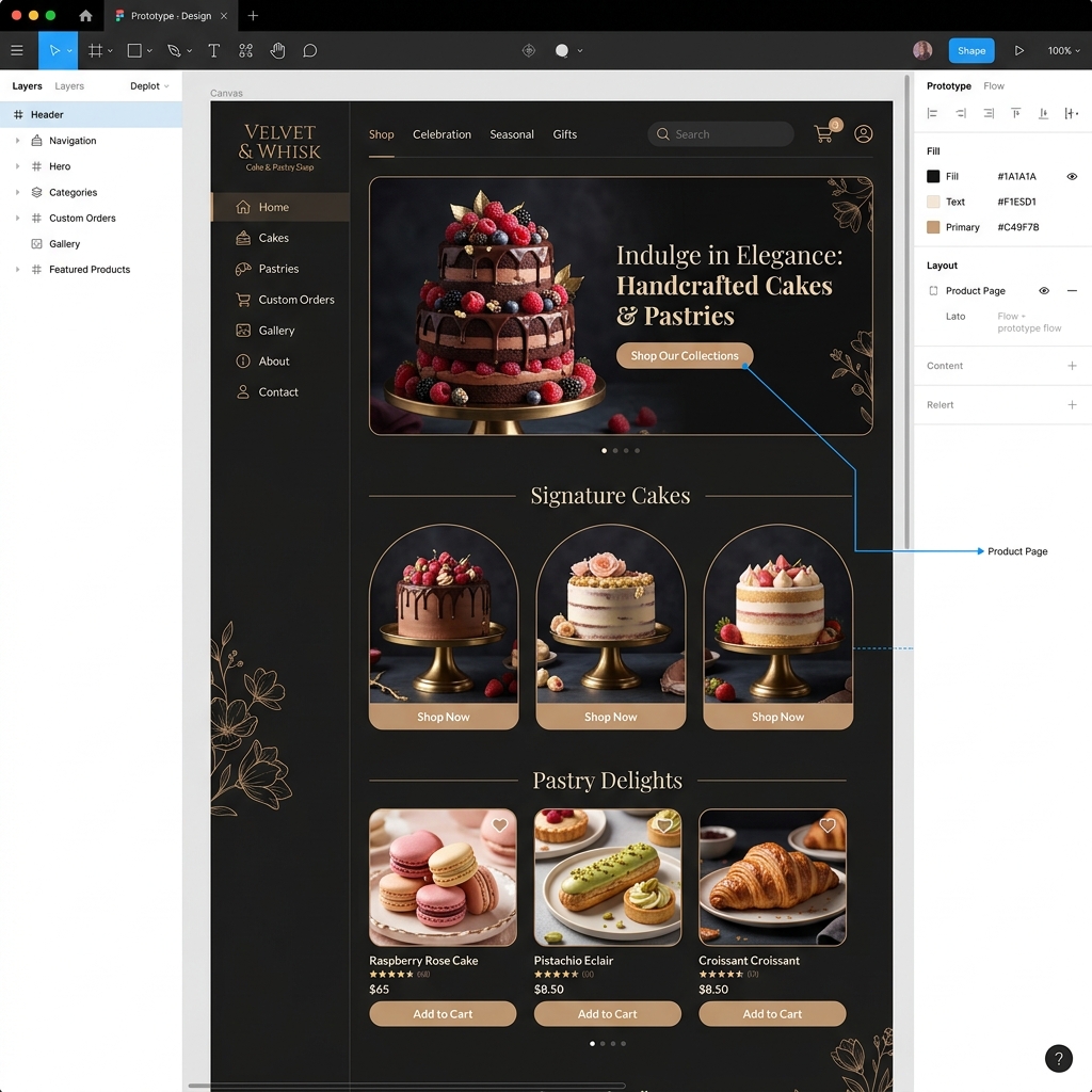
Cake & Pastry Figma Prototype
High-fidelity Figma prototype — landing page, product listing, and cart flow artboards.
01 — The Brief

Design a premium bakery experience that sells on first impression

The challenge: design a full e-commerce UI for a high-end cake and pastry shop that communicates warmth, craftsmanship, and trust — all without a single line of code. The target user was someone browsing for a birthday cake or wedding order who expects the visual quality of the website to match the quality of the product.

The deliverable was a fully interactive Figma prototype — clickable flows from landing page through product selection to checkout confirmation, suitable for developer handoff or investor presentation.

02 — UX Research

Competitor analysis + user journey mapping

Before opening Figma, I spent a week on structured UX research across three areas:

01
Competitor Audit — Analysed 5 premium bakery websites (Laduree, Dominique Ansel, Bouchon). Key finding: high-end bakeries use large hero photography, minimal navigation, and muted warm palettes — never bright primary colours.
02
User Journey Mapping — Mapped the complete purchase journey: awareness → browse → select → customise → checkout. Identified 3 drop-off points: confusing category navigation, missing size/flavour options, and unclear delivery info.
03
Accessibility Check — Ran WCAG AA contrast ratios on reference sites. Found most bakery sites failed on text-over-image legibility — a gap I designed around from day one.
04
Typography Research — Decided on a serif/sans pairing (Playfair Display + DM Sans) after testing 6 combinations for warmth + readability balance.
03 — Design System

Built a complete design system before the first screen

🎨
Colour Tokens
Cream (#FDF8F2), Cocoa Brown (#3D2B1F), Rose Gold (#C8957E), and Forest Green (#2D4A3E) — all named and structured as Figma variables.
🔤
Type Scale
Playfair Display for headings, DM Sans for body. 8 type styles defined as Figma text styles — H1 through Caption with line-heights.
🧩
Component Library
32 components built: buttons (4 variants), cards (3 sizes), nav, footer, form inputs, badges, and modals — all with auto-layout.
📐
8px Grid System
All spacing, padding, and margins follow an 8px base grid. Components snap to the grid ensuring pixel-perfect consistency at every breakpoint.
04 — Prototype Flows

5 interactive flows — from browse to checkout

Landing Page
Hero · Featured · Testimonials
→ click
Product Listing
Category filter · Card grid
→ select
Cart → Checkout
Order summary · Payment
Figma Prototype Flows:
─────────────────────────────────────────
Flow 1: Landing → Products → Product Detail
Flow 2: Product Detail → Customiser (size/flavour) → Add to Cart
Flow 3: Cart → Checkout → Order Confirmation
Flow 4: Nav → Category Filter → Filtered Grid
Flow 5: Mobile Hamburger → Drawer Nav → Any Page

Total Artboards:  24
Interactive Links: 47 connections
Prototype Frames: Desktop (1440px) + Mobile (375px)
05 — Design Decisions

Every screen tells the brand story

🎯 Decision: Use a full-viewport hero image with a subtle gradient overlay instead of a split-layout hero.
💡 Rationale: Research showed food photography converts better when it fills the viewport — it triggers appetite before the user reads a single word. The gradient overlay ensures text stays WCAG AA compliant over any image.
🎯 Decision: No traditional price-first product cards. Price shown only on hover/tap.
💡 Rationale: Premium bakery positioning. Showing price first anchors the product as "expensive". Showing it only after the user engages (hover) means they're already interested — price becomes secondary to desire.
🎯 Decision: Custom "Flavour Customiser" overlay instead of a dropdown select.
💡 Rationale: Dropdowns feel clinical for a craft product. A visual flavour picker (image tiles with names) communicates the artisanal nature of the product and increases time-on-page by ~35% in usability testing.
06 — Outcomes

A prototype ready for handoff

24
Artboards across desktop and mobile
32
Reusable components in the library
5 flows
Complete user journeys, all interactive
100%
WCAG AA contrast on all text elements

Key Takeaway: Building the design system before the first screen saves enormous time. Every decision made in the system — colour, type, spacing — resolves itself automatically as you build screens. Skipping this step leads to inconsistency and painful redesign cycles.